
Architectural Styles and Revivals: Romanesque Revival Commercial Buildings
(Written by Dr. Les Crocker, UWL Emeritus Professor of Art History)
This blog is second in a series on the Romanesque Revival. For more background on this revival, see Architectural Styles & Revivals: Romanesque Revival Public Buildings.
Commercial buildings were large enough to make use of the Romanesque Revival style. In La Crosse, the two largest use no decoration, while the smaller one uses relief sculpture to enliven the surface.
McMillan Building, 401 Main St., 1886
The McMillan building, designed by Long & Kees of Minneapolis, dominates its block with four wide, round arches, each covering a stack of three-window bays three stories high. The fifth story is a row of square headed windows like those on the second and third floors but making a continuous line to close the top of the building. The outset entrance with a thick arch is set on stubby columns and the rusticated masonry certainly gives it a rough, but sturdy, appearance.
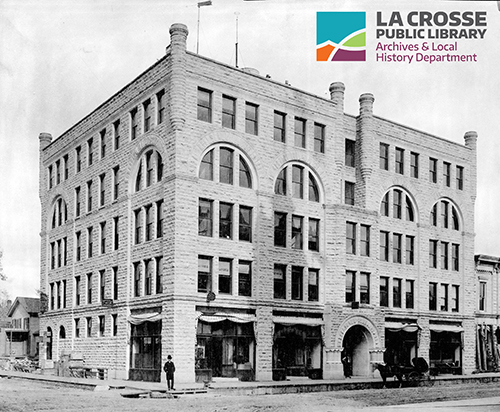
This early photo of the McMillan building shows how prominent the center arch was next to the ground floor shops on either side.
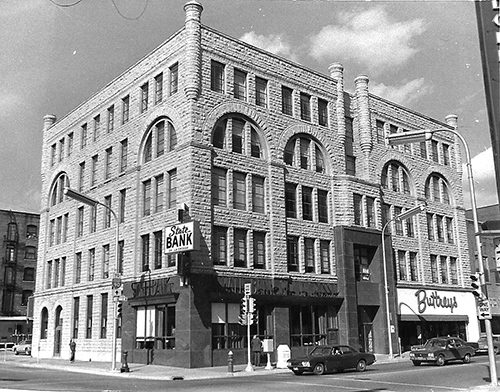
Sometime in the early 1960s I think; a new brown marble front was applied to the ground floor and entrance area.
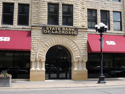
That marble has recently been removed and the original entrance can be seen. 2013 photo by author.
Batavian Bank, 319 Main St., 1888
The Batavian Bank uses three tall bays capped with rusticated round arches. Like the McMillan Building, the ground floor front was covered in sleek brown marble that had no relation to the older stone and what was worse it had a large aluminum sign covering part of the ground floor and all of the second floor. Which pretty much defines ugly.
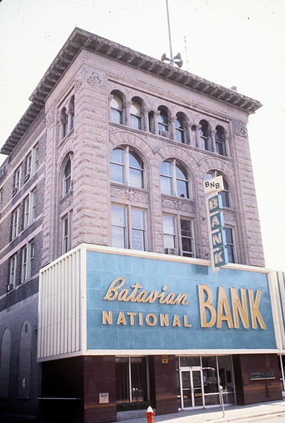
The Batavian Bank building as it looked in 1977, still with the addition of the mid-century façade over the second-story. 1977 photo by author.
The old photo below shows the original appearance. The two lowest floors are treated as a unit with three linked round arches across the front and thick corner piers to support the weight above. At a time when many architects were using steel frames to allow more windows and open interiors, the Romanesque revival ignores the new materials. Instead, it celebrates the earlier triumph of the arch overcoming the tyranny of the solid wall.
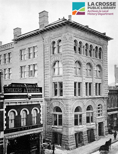
This photo from 1892 shows the entrance was originally in the eastern most bay and two shops occupied the rest of the front with bay windows above them.
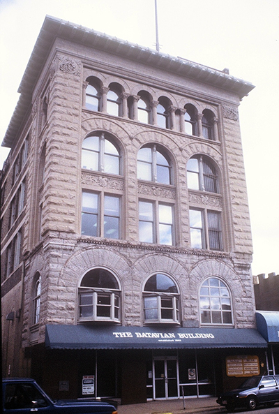
The third and fourth stories are also defined by linked arches, but the stone has a rougher surface. The fifth story has three sets of paired arches with smooth surfaces supported on columns. Paired windows with thick arches on the fifth floor are supported on columns with florid capitals. 1991 photo by author.
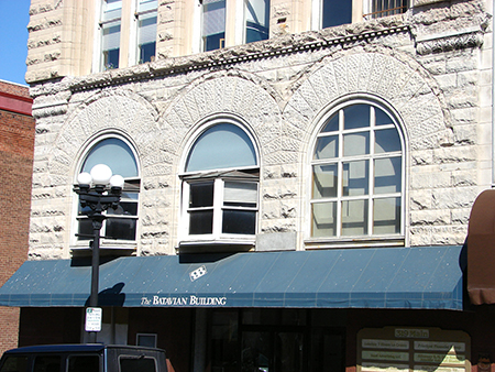
The stonework of the second floor shows some damage caused by the huge ugly sign. 2010 photo by author.
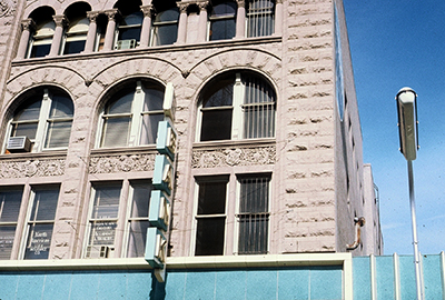
But the marvelous carvings and the columns remain intact. 1977 photo by author.
The Barron Building, 426 Main St., 1891
The Barron Building uses brick instead of stone, but the tall, thin arches are another interpretation of the same style. The emphasis is on the Main Street side with a steel beam spanning the huge windows of the store front. This is a denial of the wall, a wall that would seem necessary to support the upper floors. The McMillan and Batavian Bank buildings accepted the Romanesque wall; here the architect ignores tradition.
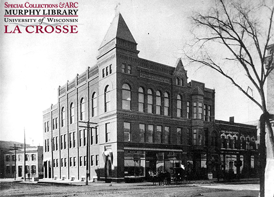
The Fifth Avenue side of the building is rather plain with pilasters between the bays rising to the full height of the building and ending in a complex cornice.
The nineteenth century loved towers. The cost accountants of today hate them. Not useable space, high maintenance costs; so, chop it off. There is a lower, narrow section to the west of the main building that must have been an addition; it just doesn't fit with the original structure.
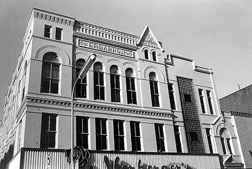
This photo from 1977 shows the tower having been cut down. 1977 photo by author.
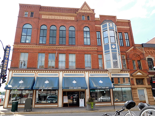
The bay window on the second and third stories was later removed and replaced with glass block and more recently the glass block was replaced with a rather garish attempt at the original bay window. 2016 photo by author.
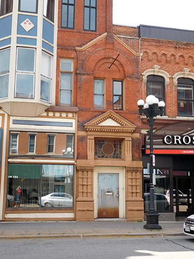
The new, secondary entrance was not Romanesque in form or decoration. Above the stone window heads of the building next door, you can see the “hanging” arches that were a common decoration on the exterior of Romanesque churches. 2016 photo by author.
In the photo above, the additional ground floor entranceway has three columns banded together on each side of the door. Above that, a classical pediment with dentil blocks sits on undersized square columns. All of this was done in a stone completely different from the original brick. This photo shows the tan colored sort-of-classical forms against the brick, round arch within a gable that was itself an addition.
Schintgen Building, 223 N. 3rd St.
The Schintgen Building has a wonderful round arch over the entrances to the double store. Romanesque doesn't usually work in smaller applications, but here the arch, the bay window above, and the semi-circular pediment define the building. The units that flank the arch are visual bracing for the main attraction.
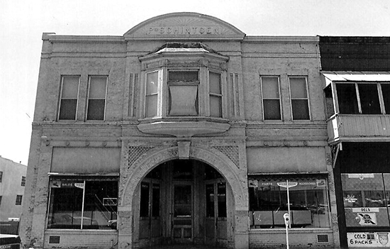
This photo shows that the building had been painted for many years. 1977 photo by author.
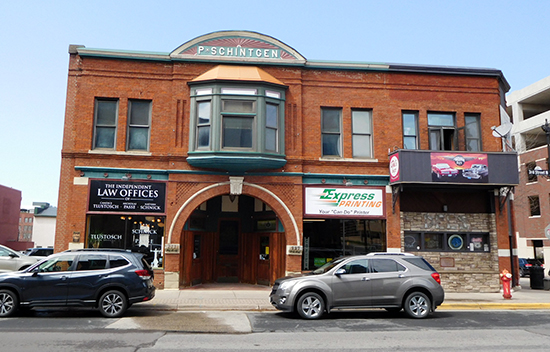
By 2020, the paint had been removed but the signs scream at the viewer and the fake stone and signage of the bar next door were still distractions. 2020 photo by author.
Tillman-Leithold Building, 116 S. 4th St., 1889
The Tillman-Leithold Building, designed by Stolze & Schick, has the vertical emphasis of a skyscraper, dominating the lower buildings around it.
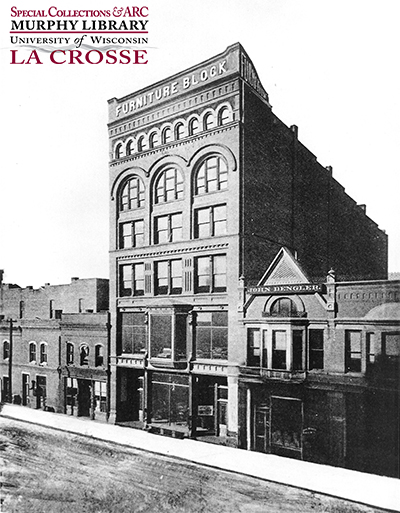
This photo showcases what was now possible with the use of iron and steel. The Tillman building dwarfs those around it.
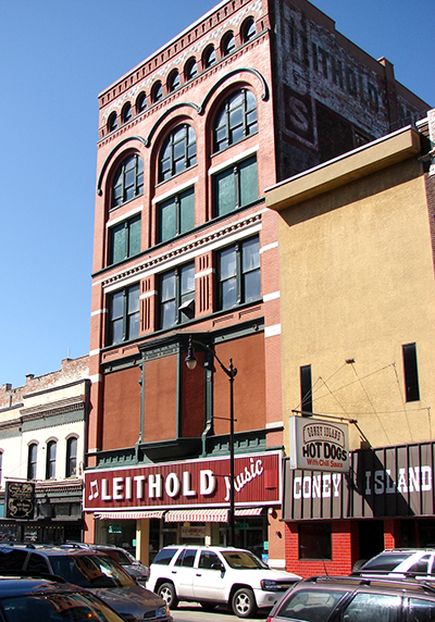
For years the second-floor bay and the windows flanking it were covered with plywood which really diminished the entire block. 2010 photo by author.
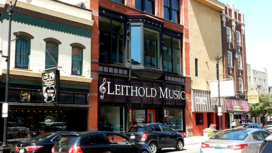
The change in signage allows the old front to be visible. 2023 photo by author.
Iron and steel were revolutionary materials at the time and most business owners were proud of their iron fronts. The ground floor interior has soaring iron columns that allow a vast open space that would not have been possible with brick, stone, or frame construction. The interior really shows what the iron frame revolution was all about.
The upper three stories are traditional brick construction, not iron frame. The third floor is a transitional floor, between the first and second floors with their right-angled iron frame and the two upper floors with their round arches, the nine small arches across the top act as a cornice to show where the building ends. The molded brick of the piers softens the surface.
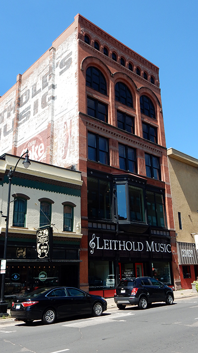
The recent renovation has restored the first two floors of the front. Now the steel beams that allow the large windows are emphasized as they were intended to be. 2023 photo by author.
The Tillman-Leithold building's return to glory marks another major improvement for the downtown area and should inspire other businesses in the area to look at what can be done to return their buildings to their original appearance. Years ago, preservationists used the expression "Preservation doesn't cost, it pays". The truth of that mantra can be seen today as the streets of downtown are busy with shopping tourists, while the mall parking lots are empty.
Next week, we will see how the Romanesque revival is represented in domestic architecture in La Crosse!
Other entries in this series
Architectural Styles and Revivals
Architectural Styles and Revivals: The Greek and Roman Revivals
Architectural Styles and Revivals: The Gothic Revival
Architectural Styles and Revivals: The Exotic Revival
Architectural Styles and Revivals: The Italianate Style
Architectural Styles and Revivals: The Second Empire Style
Architectural Styles and Revivals: The Queen Anne Style
Architectural Styles and Revivals: The Colonial Revival
Architectural Styles and Revivals: Romanesque Revival Public Buildings
Architectural Styles and Revivals: Romanesque Revival Homes
Architectural Styles and Revivals: Religious Romanesque
