
Architectural Styles and Revivals: Religious Romanesque
(Written by Dr. Les Crocker, UWL Emeritus Professor of Art History)
This blog is fourth in a series on the Romanesque Revival. For more background on this revival, see Architectural Styles & Revivals: Romanesque Revival Public Buildings.
The most obvious feature in the Romanesque style is the round arch, rather than the Gothic pointed arch. Round arches require more massive walls to restrain the load above them, so the Romanesque interiors were often rather dark with a few small windows placed high up in churches. Rough-faced masonry provided the sense of age and solidity of form. The young country of the United States still had an inferiority complex about its lack of history and buildings that looked old seemed to have fulfilled a need.
The Romanesque style was a religious style, for the most part and it is not surprising that it was very popular among the major Christian denominations in stone versions such as Christ Episcopal and the German Methodist, and in brick versions that were more common in German areas.
There are many churches in La Crosse that use Romanesque detail such as round arches, hanging arches, and simple columns, but I am going to discuss the four best examples and one extraordinary one.
Christ Episcopal Church, 111 9th St., 1898
Christ Episcopal Church at Main and Ninth streets was built to the designs of M.S. Detweiler, a somewhat peculiar architect who couldn't decide where to live. However, his design skills were exceptional as he created a church with many of the characteristics of the Romanesque, enough to be convincing anyway, while avoiding the looming darkness of many of the original Romanesque churches.
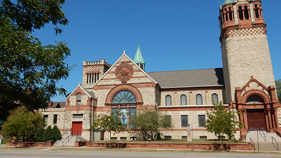
The Main St. view of Christ Episcopal Church shows off its Romanesque features. 2023 photo by author.
The large stone churches of southern Europe are the source of this magnificent building, which replaced a simple Gothic revival church discussed in the Gothic revival blog. Red sandstone contrasts with the tan stone of the building, but some of the soft, red stone used for carving has weathered badly, while the harder variety has weathered well.
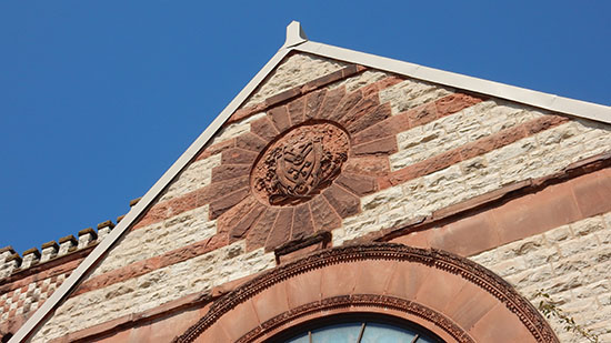
The red Michigan sandstone medallion above the transept window shows signs of weathering. 2023 photo by author.
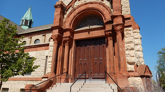
The red sandstone arch and columns that surround this entrance at the base of the tower are also showing wear. 2023 photo by author.
The bell tower, set to one side of the nave, is more usual in Italian churches where bell towers originally were separate from the church. Think of the Florence Cathedral or the leaning bell tower at Pisa. In later years, they were attached to one side of the facade.
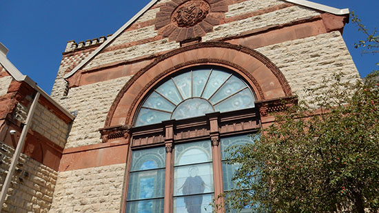
The great window in the transept, believed to be by the Tiffany studio, is more of a Gothic device, but here the use of the window within a round arch doesn't violate tradition too badly. 2023 photo by author.
The fleche is a short spire that often covered an opening where the transept met the nave. Useful for light in that part of the church furthest from any windows, they also provided some ventilation. Many people will remember the collapse of the fleche on Notre Dame in Paris during the recent fire. The one on Christ Episcopal is Gothic in style, but that's all right because Romanesque churches often got Gothic additions or changes.
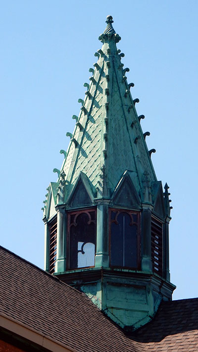
Detail of the Gothic style fleche atop Christ Episcopal Church. 2023 photo by author.
Churches in much of Europe often have small sculptures in the upper areas of the vaults. Most of them have no emblem, if they are supposed to be saints, nor identifying names. No wings, crowns, or other implements to indicate angels. We are sure they aren't portraits; the Catholic church rejected portraiture in its arts until the Renaissance. So, we don't know what they are supposed to be. Unfortunately, the carved sculptures on Christ Episcopal Church were done in the softer red sandstone and many areas have weathered into lumps.
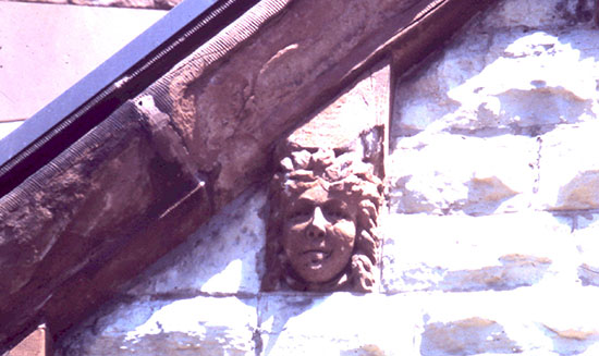
A sculpture of a face appears above the 9th St. entrance. 1980 photo by author.
German Methodist Church, 525 7th St. S., 1894
The German Methodist Church at 7th and Ferry was built in 1894. It was designed by Andrew Roth Jr., a mostly self-taught local carpenter who improved his design skills by working with better educated local architects.
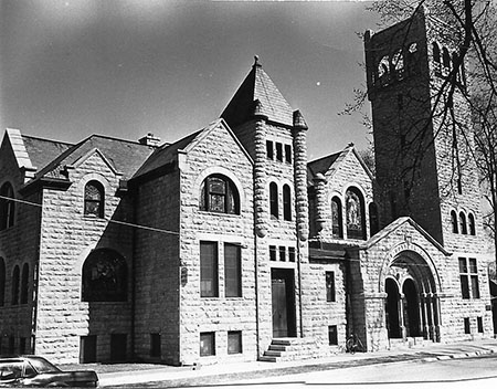
The west side of the building best shows the massing of the different parts, unified by common shapes and the rough stone used for the exterior. The bell tower is obviously the most commanding feature. 1973 photo by author.
The tower has few openings, notable are the three small windows lined up on three levels within a groove cut into the surface making a deep shadow line. The top of the tower is open, with three round arches on each side. Corner buttresses add vertical interest, while absorbing the outward thrust of the arches. A simple stone railing between the square columns closes the lower part of the arches. The arches and the square columns that support them are rendered in smoothed stone to distinguish them from the rough stone of the building. It's a way of saying "Look here, these arches are important."
Heavy buttresses frame the end wall with its great window within a round arch.
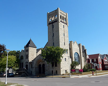
Today the Neighborhood City Church inhabits the former home of the German Methodist Church. 2023 photo by author.
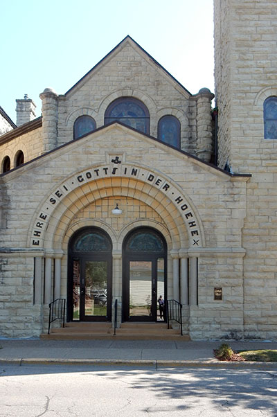
The entrance is rather simple for so massive a building. Two round arches within three concentric arches. Simple pillow capitals cap the smooth surfaced columns. 2023 photo by author.
St. James Church, 1013 Caledonia St., 1900
St. James Church was also designed by Andrew Roth, Jr., but uses a totally different tradition. He also designed the First Evangelical Lutheran church, so it is interesting to compare the three churches.
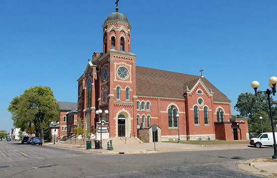
A fire in 1900 destroyed the original 1886 wood frame church, spurring construction of a new brick and stone structure. 2023 photo by author.
The facade of St. James is divided into three vertical units with an entrance in each of the units. White stone is used for the entrance arches, in a band that connects the stone arches above the windows, around the round tower window on the larger tower, and in a multitude of hanging arches that are set just below the eaves.
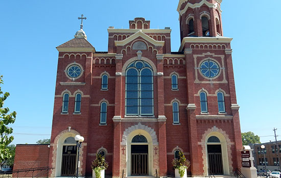
The combination of red brick and white stone makes for a very decorated front, far more so than in the original Romanesque buildings. 2023 photo by author.
First Evangelical Lutheran Church, 400 West Ave., 1904
The First Evangelical Lutheran Church, was designed by Andrew Roth, Jr. and his older partner Hugo Schick, who had lost his longtime partner in 1899.
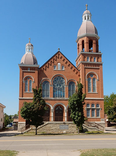
The facade of the brick church has none of the massiveness of stone versions of the style. The towers that flank the central gable are of different heights and slightly different brickwork and stone trim. The taller tower has an open octagonal lantern with octagonal, pointed dome influenced by Byzantine Christian churches.
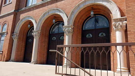
The three arches of the entrance are concentric with three smaller arches inside the large stone arches that rest on very florid capitals above a smooth column shaft. 2023 photo by author.
The difference in height of the towers was done in imitation of what had happened in Europe many times. A church congregation wanted a new church and it was begun. But they ran out of money, maybe a war happened, a famine reduced the local population. All sorts of things could happen, but the result was an interruption in construction that might last a century or more. In some cases, the short tower might be there because there wasn't money to match the large older tower. Or in some cases the taller, more elaborate tower might be the later one done when the congregation was larger and had more money. So, the difference in towers was a not-so-subtle way of imitating a building that had changed over the centuries.
The most Romanesque feature of the building are the “hanging” arches that seem to support the gable roof. Just as brackets define the Italianate style, so do hanging arches define the Romanesque revival.
The three arches of the entrance are well proportioned to an Italian Renaissance standard, not the tall thin arches of the French and German Romanesque. The three great windows that span the space between towers repeat the entrance arches below. A Palladian window high in the gable repeats the shape of the arches below.
Maria Angelorum Chapel, 1902-06
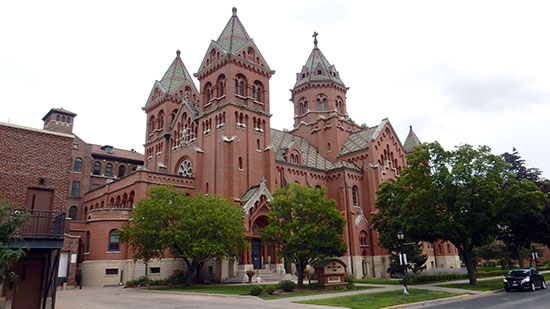
Many of the Romanesque Revival features mentioned already can be seen here, but on a much grander scale. 2023 photo by author.
Maria Angelorum Chapel is a gorgeous building that seems to be a direct continuation of the Romanesque style, rather than a revival. The building is modeled after a church in Viterbo, Italy, but could be a basilica somewhere in northern Italy, southern France, or even parts of what became Germany. It was built in 1902-06, far quicker than the churches of the original Romanesque style.
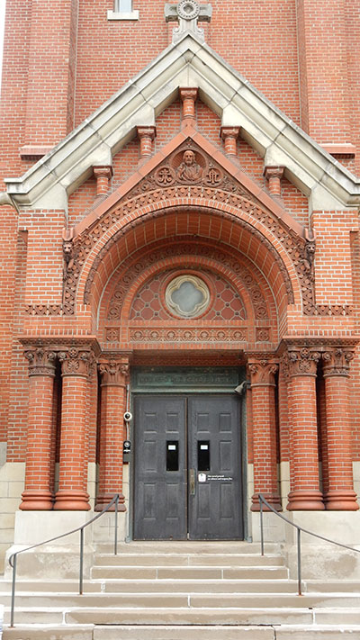
A richly decorated portico projects from the building. 2023 photo by author.
Molded brick columns with capitals based on the Ionic order and ringed stone bases. A barrel vault with molded brick edges and decoration over the entire surface rises into the stone pediment without a bottom cornice. Short columns support the stone pediment but seem to be sinking into the brickwork below. A feature seen at the cathedral in Pisa, Italy. Solid and massive are the two words that come to mind most often when looking at Romanesque churches.
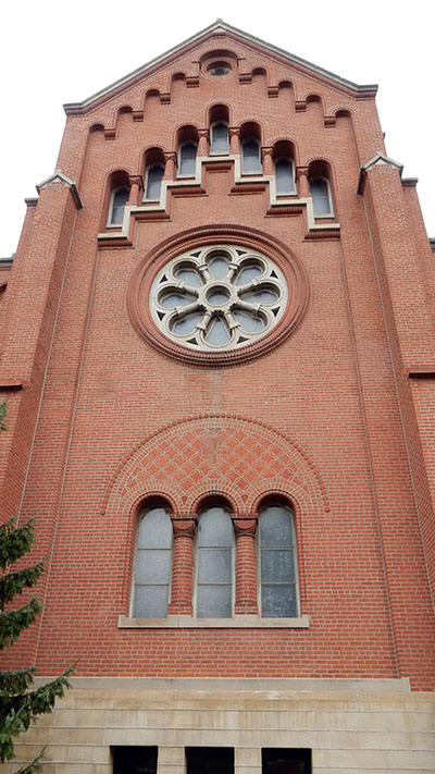
The Romanesque features here are repeated in a way that draws the eye upward. 2023 photo by author.
The stone ground floor carries the brick upper levels with three narrow, round arch windows repeating the three-square headed ones below. A large “wheel” window surrounded by raised brickwork provides a little light on the interior. Wheel windows had a stone framework, like the spokes on a wheel. They are a predecessor to the Gothic rose windows; another way of showing the great age of the structure. The gable has hanging arches with stair stepped, tall, narrow windows below. The stair stepping is used in several Italian churches, most notably at Pisa.
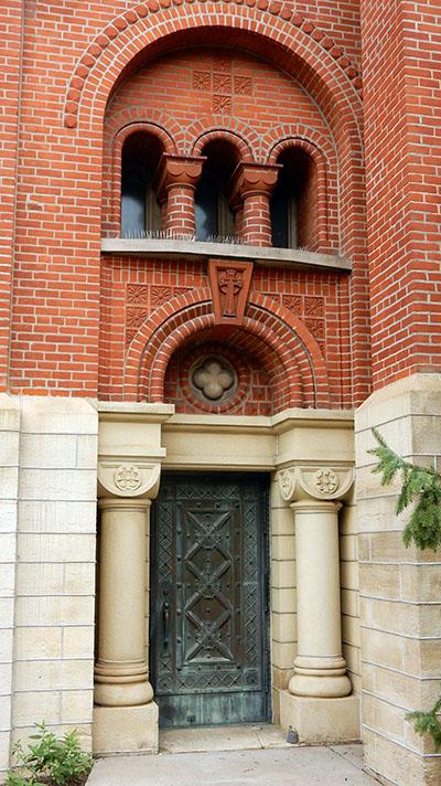
This entrance may be small, but it packs in many Romanesque details. 2023 photo by author.
This minor doorway shows many Romanesque features. The bronze door was for beauty as well as safety in those troubled times. Stocky columns with bulbous bases, smooth shafts and four-sided capitals carry a simplified entablature that separates the stone walled ground floor from the brick upper areas. A round arch of molded brick with an exaggerated keystone has terra cotta tiles in the spandrels. Two stubby columns with oversized capitals support the upper level wall, all recessed beneath a large, round arch. Openings were small, in part for defense but also because builders weren't sure how much weight their wall, their arch, or their column would support. That sort of technical information was lost as the Roman empire collapsed.
Most of the revivals following the Roman and Greek worlds were fun. They had no political or religious basis and while they were often proclaimed as “uplifting” to the society they were mostly entertainment, curiosities, generic foreignness. Pointed arches on one-story frame houses are absurd; they carry no weight. Pointed arches were designed to be used in stone or brick and their use in a frame building is really decorative instead of supportive. The delightful Gothic Revival cottages are complete fabrications except in name. Stud frame construction did not exist in the middle ages and the peasants certainly did not have window glass and cast-iron stoves to warm their toes.
It was a time when the outhouse was moved into the home, bath tubs became common in middle class houses, gas lighting allowed night time activities, whole house heating was done with coal, telegraphic communication could reach any town in the nation on a railroad, cross country trips by rail were possible if not always comfortable. It must have seemed as if everything was changing in the Midwest as never before but the dominant direction in housing was a pastiche of the past. Certainly, some of the enthusiasm was generated by an open curiosity about the past, but for most people the styles were just that, temporary assemblies of decorative elements applied to whatever structure you could afford.
Other entries in this series
Architectural Styles and Revivals
Architectural Styles and Revivals: The Greek and Roman Revivals
Architectural Styles and Revivals: The Gothic Revival
Architectural Styles and Revivals: The Exotic Revival
Architectural Styles and Revivals: The Italianate Style
Architectural Styles and Revivals: The Second Empire Style
Architectural Styles and Revivals: The Queen Anne Style
Architectural Styles and Revivals: The Colonial Revival
Architectural Styles and Revivals: Romanesque Revival Public Buildings
Architectural Styles and Revivals: Romanesque Revival Commercial Buildings
Architectural Styles and Revivals: Romanesque Revival Homes
